sepcooked
A recipe site for the busy home cook.
Overview
This is more than just a recipe website—it’s designed to make it easy for users to get their meal on the table. It’s built with one clear goal: to make cooking simple, less intimidating, and helpful for the busy home cook make their dish.
ROLE
Product Designer
UX Researcher
UI Designer
Web Developer
METHODS & TOOLS
Survey, Primary Research, Secondary research, Competitive Audit, lo/mid/high prototypes
DATE
April 2025 - present
PRACTICES
User Research, UX & UI Design, Prototyping, User Interviews, User Persona, Competitive Analysis, Front-end Development
Most recipe sites are blogs...
I wanted to get a quick meal on the table, so I searched on Google for “Chicken fried rice” recipes. I reviewed the top results and I realized: most recipe sites are blogs...
They contain a lot of information—like the background of a dish, the author’s personal story, a couple cooking tips, etc. But as a busy home cook, the two most important pieces in a recipe are: the ingredient list and the steps.
After reviewing the top results, here’s what they all had in common:
Finding #1: Lots of distractions
There are a lot of ads and pop-up windows that are distracting, and holding me back from reading the recipe.
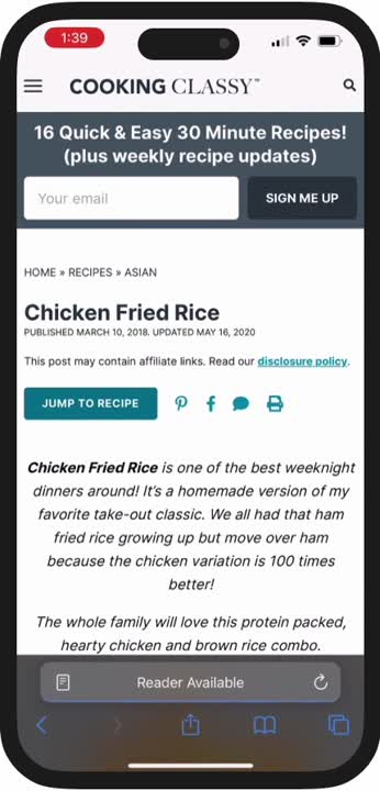
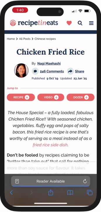
Finding #2: Lots of content
I found myself scrolling past all of the extra content just to look for the recipe.
Finding #3: Constantly referring back to the ingredients list
With most recipes that I’ve seen, the only way to refer back to the ingredient list when following the steps is by scrolling back and forth.
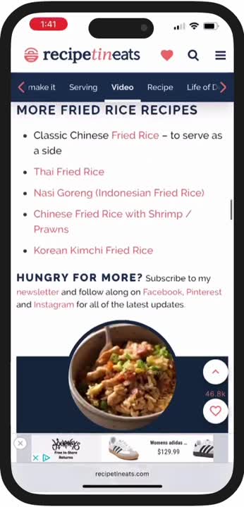
Additional findings
- plenty of supplementary photos
- very difficult to follow on mobile
Conclusion
These are the findings that I think can frustrate the busy home cook—especially for those who are just starting out. That said, these are my personal observations and may not reflect everyone’s experience. To get a broader perspective, I’ll be speaking with other home cooks to better understand the challenges they face and how I can help solve them.
Understanding the problem...
I want to know how people feel about following a blog-style recipe site when cooking their meals. I interviewed 6 home cooks in the Toronto area to see what they think.
User interview goals:
- Understand their main goal when visiting/searching for recipe sites
- Gain insight into the needs and behaviours of recipe site users
- Identify frustrations when following a recipe
The user interviews revealed 4 key insights:
Most people skim the “blog stuff”
The main goal for users is to get a meal on the table, so most people skim the “blog stuff” and go straight to what they need to read to cook their meal.
Phone or tablet is their main device
Most users use their mobile devices for following recipes because of its convenient size, as oppose to using a laptop/desktop.
Ads and pop-ups are distracting
The main source of friction for users is the amount of distractions they see when following their recipes. This coupled with long form content overwhelms the user.
Photos of each step is helpful
Novice home cooks need some validation that they are executing each step properly, so referring to photos while they cook is very useful.
“I do learn something from reading the extra content, but I just want to make the dish.” - A
Redefining our problem...
The main goal for users is to find a meal to cook and get it on the table. With that in mind, here are the key insights that stood out to me the most:
Some information > no information
- A surprising insight was how much users found some value from the long-form content.
- Although users find some value in the extra content, it was expressed by many that most of it isn’t really needed and rather not have to scroll to find the recipe.
Too many distractions
- Ads, pop-ups, and unnecessary text hold users back from getting a quick meal on the table.
- Since most people use their phone or tablet to follow a recipe, the number of distractions can be overwhelming.
- To bypass distractions, users often have to scroll more than they’d like, which made it difficult to stay organized.
From learning how users feel about blog-style recipe sites, and knowing their main goal in using a recipe site...
How might we create a more user-friendly recipe site with far less distractions?
Translating needs into features...
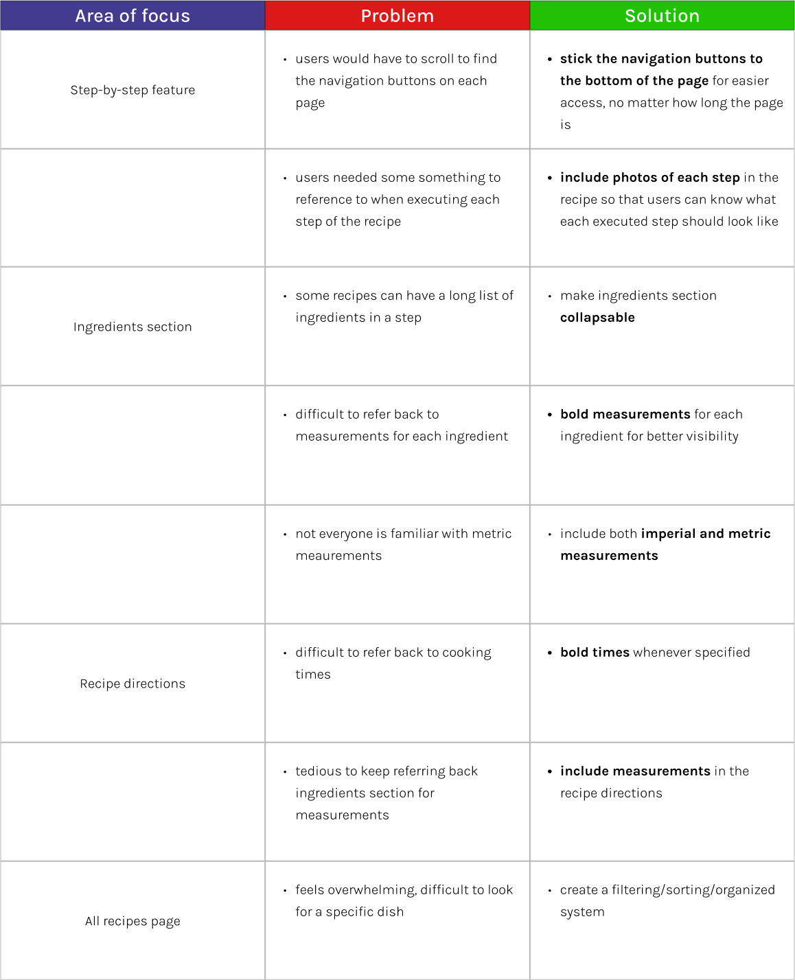
Based on insights gathered from user interviews, I brainstormed several ideas to address the key needs and pain points users face when navigating blog-style recipe sites. The table below outlines the proposed features, each labeled with its corresponding priority.
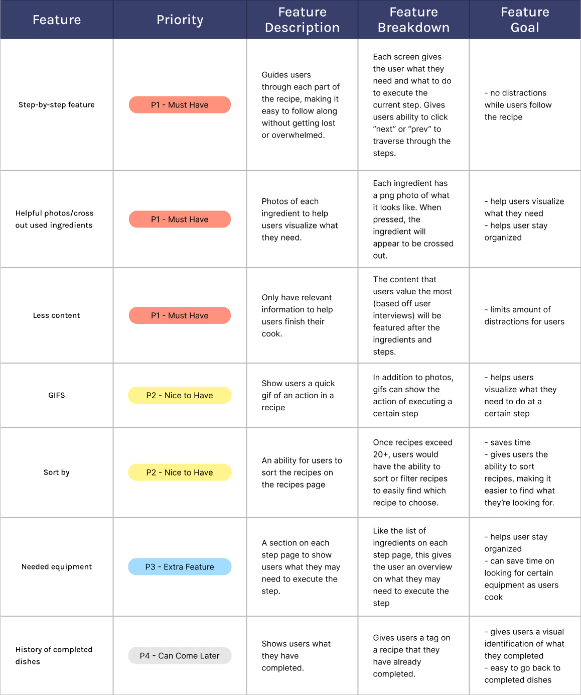
Features were prioritized based on how well their value aligned with the project's goals and users' needs.
Design & Prototype...
With a better understanding of the users and priority app features, I began designing what these features would look like. My main focus was:
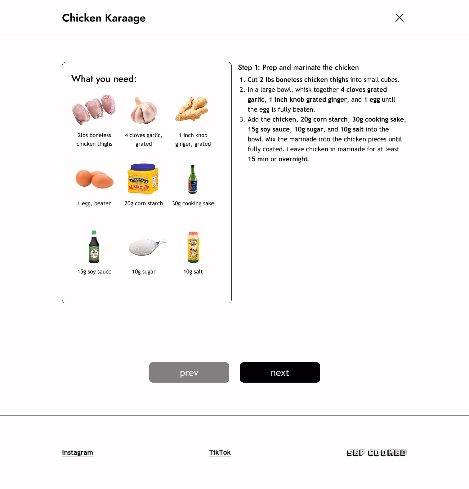
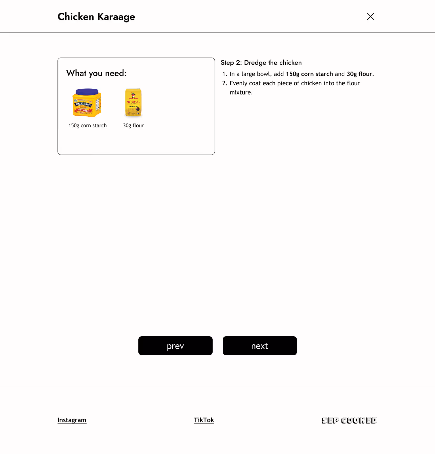
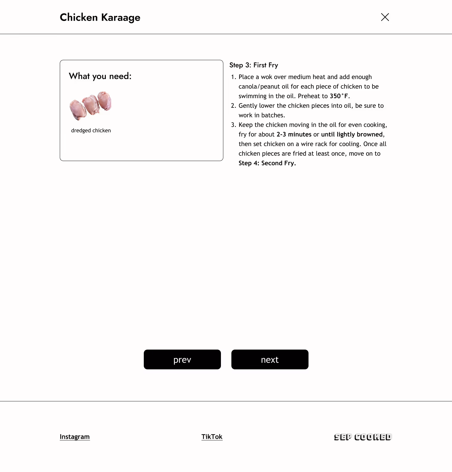
Providing users with a distraction-free way to follow each step of a recipe
Low/High Fidelity Wireframes
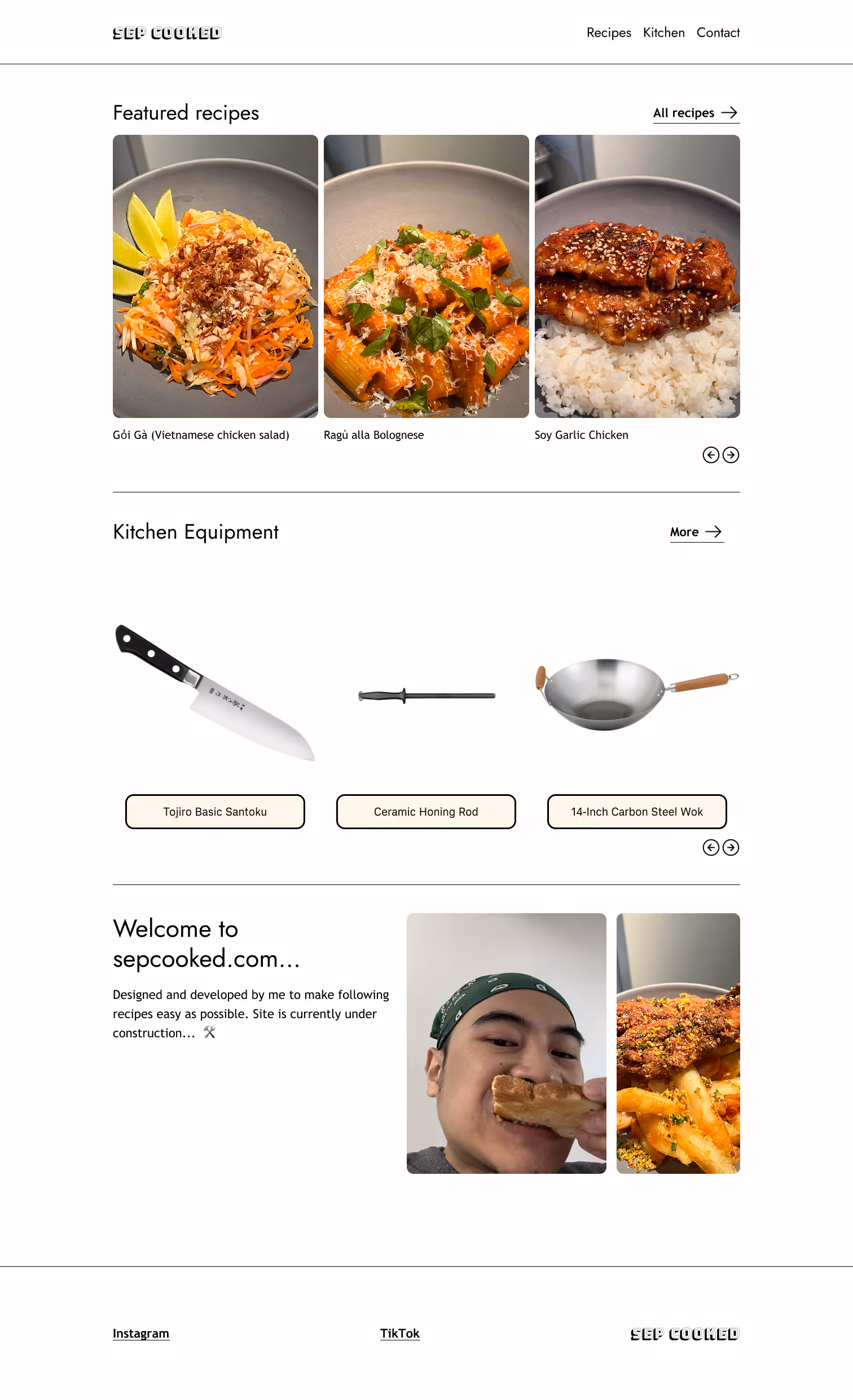
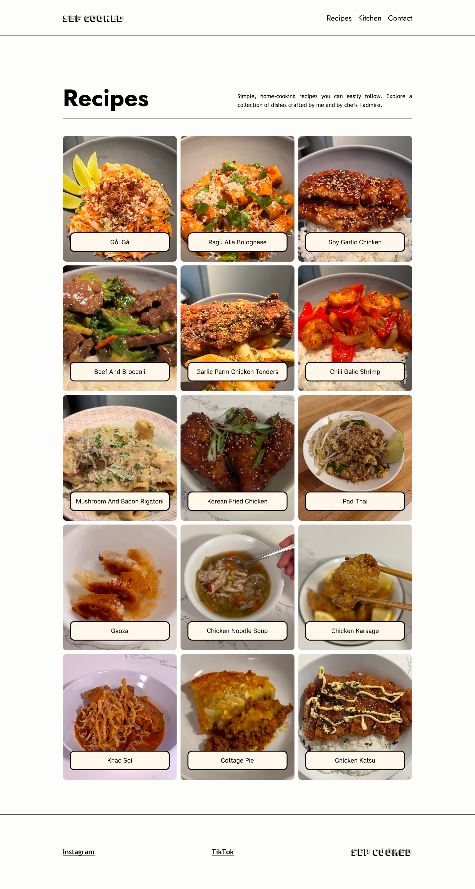
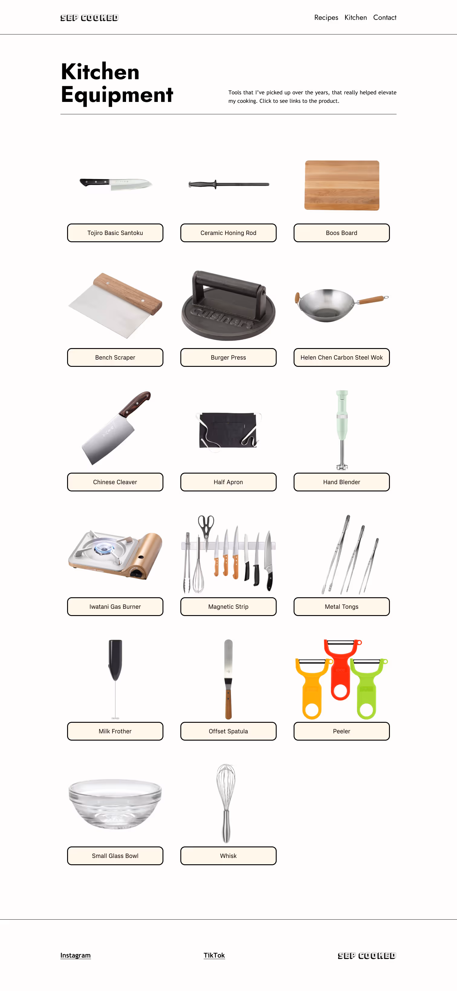
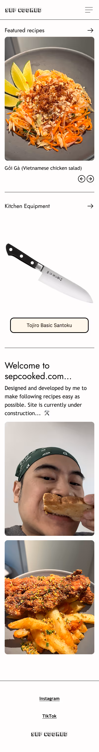
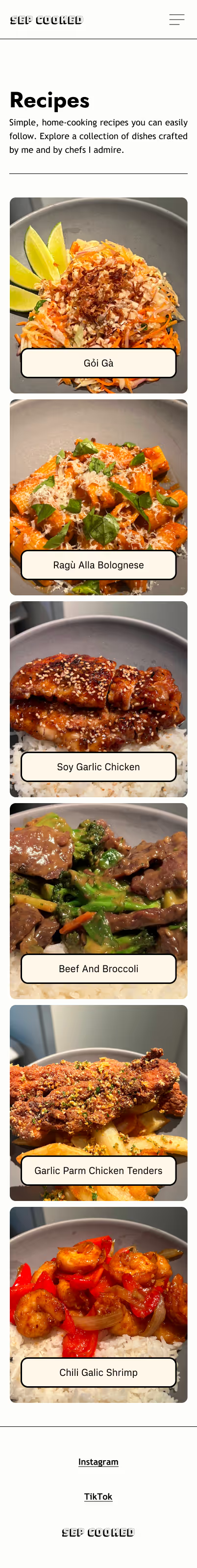
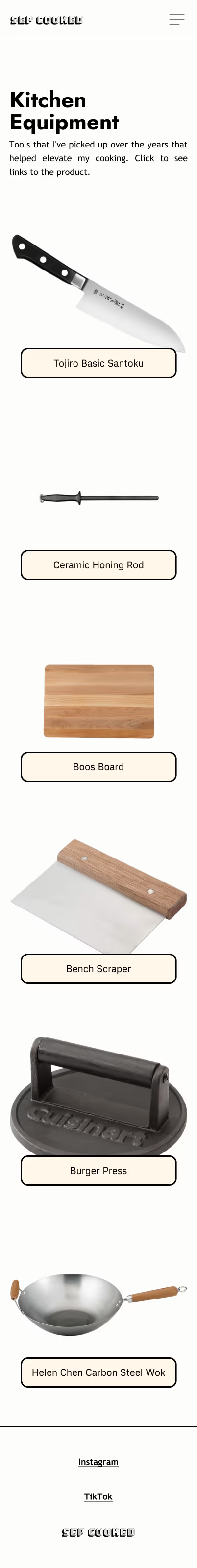
To establish the user flow and content layout, I began by creating wireframes for the key screens that relates to my main focus: the recipe screen and the step-by-step feature screens. Then I included the homepage, recipes page, and kitchen equipment page for the high-fidelity wireframes.
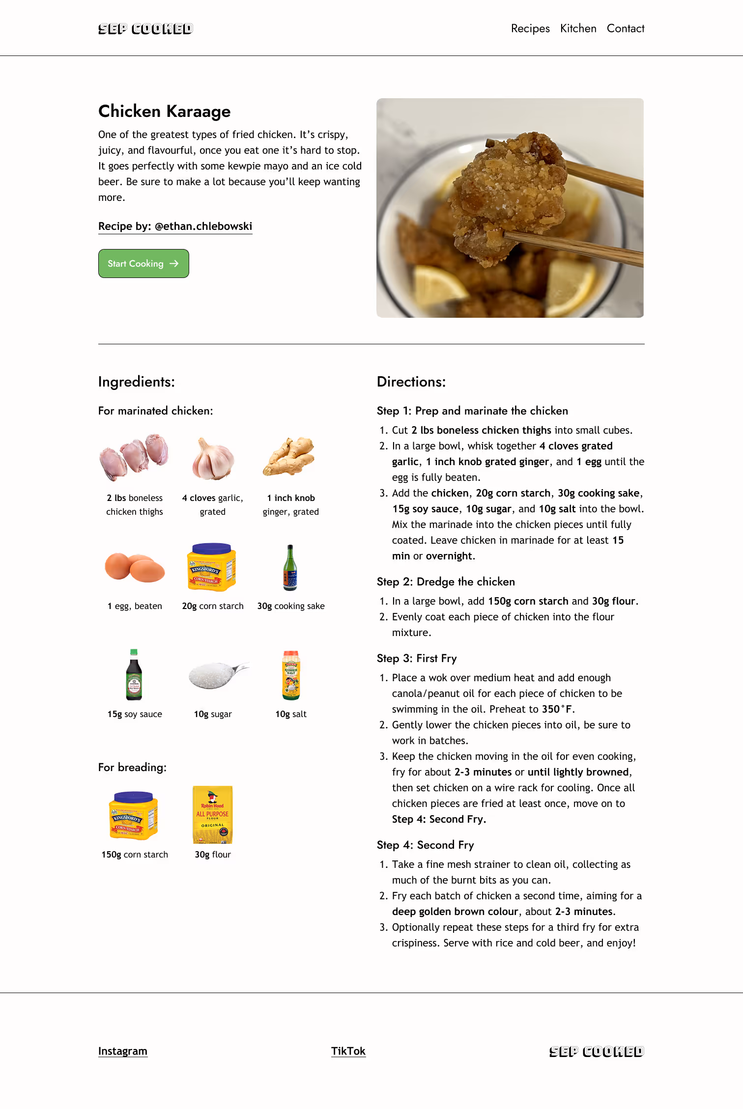
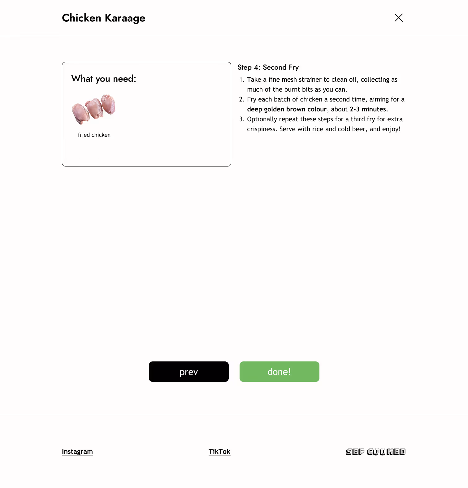
Recipe page
.avif)
.avif)
Step-by-step feature
.avif)
.avif)
High Fidelity Wireframes

Test & Iterate...
Once the first prototype was finalized, I built the site in Webflow to make it testable on all devices and gathered user feedback. I created a feedback form on google forms and sent it to 10 testers. Since the goal is to create a distraction-free way to follow each step of a recipe...
I wanted to know...
- Were the directions clear and easy to follow?
- Was the ingredients section helpful?
- How useful was the step-by-step feature?
Improvement to-do list
After reviewing the responses from user testing, I created a to-do list to address the key pain points and needs that emerged, ensuring the next iteration of the site would better meet user expectations:
After addressing the issues highlighted in the feedback, I implemented the suggested improvements and published the updated site on sepcooked.com. You can view the full site here.
Project reflection...
What’s next?
Following the first round of testing and the completion of the first iteration, the next steps would be to iterate and design for features that are beyond the MVP.
- Address P2-P4 priority features.
- Conduct second round of user testing to identify active usability issues.
- Implement more iterations.
Project takeaways...
It was important to me to share my love for cooking with people who may have been discouraged by how difficult it can be to follow recipe blogs. I found myself enjoying the process of empathizing with users to really zero-in on what holds them back from cooking and coming up with solutions.
Some key takeaways are:
- Create a well-organized plan. With the amount of work to be done as the sole creator, having a clear strategy was essential to efficiently manage the workload and stay on track.
- User-centered design can lead to enjoyable experiences. Talking to real users helped me create something that can turn someone who doesn’t enjoy cooking into someone excited to make their next meal.
This project reinforced my belief on how essential empathy is in the design process— it’s how I created an experience that feels approachable and enjoyable. I’m happy I was able to share my love for cooking in a way that helps others see it not as a chore, but as something they can enjoy.

